As an Amazon Associate we earn from qualifying purchases.
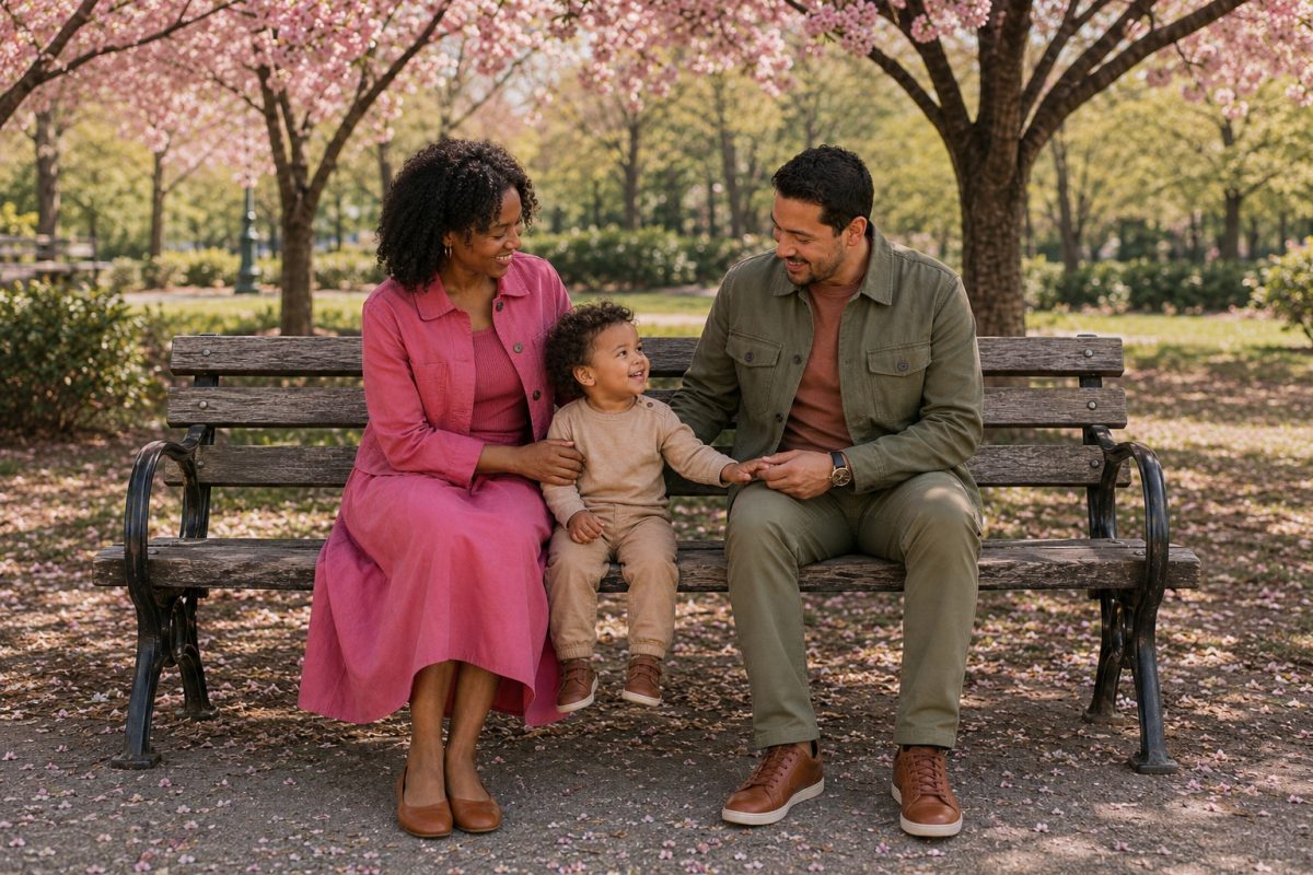
Last October I watched a family of six sort out their outfits in a gravel parking lot before a photo session at a state park. One teenager didn’t want to wear the vest, someone was reconsidering a cardigan, and the toddler already had juice on her dress. Meanwhile, the afternoon light was disappearing. It was a good reminder that deciding what everyone will wear is one of those small details that can make family photos much less stressful when it’s handled ahead of time.
What to wear for family photos comes down to one palette of two neutrals plus one accent color, spread across everyone so no two people look identical. Choose soft, mid-tone colors over bright saturated ones. Pick fabrics with a little texture and a little movement. Skip tiny busy patterns, big logos, and anything that has to be tugged back into place every ninety seconds. The same logic runs family photo outfits, couples sessions, and engagement photo outfits, with a few adjustments I will get to.
The one rule that matters most: coordinate, do not match
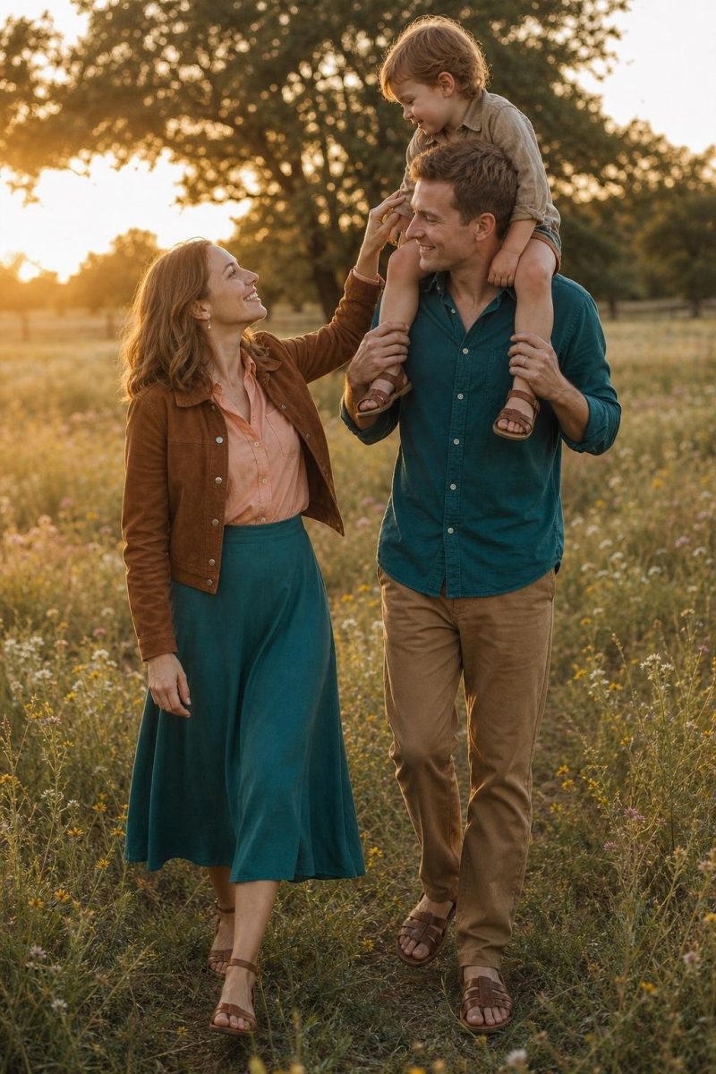
Matching means everyone wears the same thing: the same navy, the same white button down, the same wash of denim. Coordinating means everyone pulls from the same family of colors but lands somewhere different inside it. One person in oatmeal, one in warm rust, one in cream with a soft stripe, one in camel. Same world, different pieces. That distinction is the difference between a photo you frame and a photo you quietly put in a drawer.
Matching reads dated for a technical reason, not just a taste reason. When five people wear identical colors and identical silhouettes, the camera flattens them into one shape and you lose the separation between bodies, which matters because people always stand close. Identical white tops against a light background is the most common version of this, and it turns four people into one pale blob with heads.
There is also the timestamp problem. Head to toe uniformity is tied to a particular era of portrait studio, and it ages a photo fast. If you like a shared thread, look at coordinated family looks that share a palette rather than a literal uniform. My working rule: no two adults in the same color on the same garment type. If two people are both in cream tops, put one in a textured sweater and the other in a smooth blouse, or move one to oatmeal.
How to build a color palette for a group
Here is the method I use for every group session, and it takes about fifteen minutes at a kitchen table. Pick two neutrals and one accent. The neutrals carry most of the group. The accent shows up on two or three people, never on everyone.
With five people, put two in neutral one, one in neutral two, one in the accent, and one in a mix of the accent with a neutral. Then stand everyone in a row and check two things: is anyone disappearing into the person beside them, and is the accent stuck at one end of the line. Height plays into this too, since a line of people is rarely even, and outfits that work on taller frames keep proportions reading right next to shorter family members. Photographers rearrange people constantly, so a palette that only works in one arrangement will fail during the session.
Neutral does not mean beige and nothing else. Soft sage, dusty blue, warm grey, and muted terracotta all behave like neutrals on camera because they are low in saturation, and saturation is what decides whether a color sits back politely or shouts. For a starting point that almost never fails, neutral tones for couples sessions are the safest foundation, then add one color with a little life in it.
| Palette | Works Best For | Avoid With |
|---|---|---|
| Warm neutrals: cream, oatmeal, camel, soft rust | Golden hour fields, autumn parks, barns, dry grass | Cool grey concrete, overcast beach light, snow |
| Cool neutrals: soft grey, dove, stone, white, pale blue | Studio work, modern architecture, coastal fog, winter light | Golden fields at sunset, red brick, autumn leaves |
| Muted earth tones: olive, clay, mushroom, muted mustard | Wooded trails, mountains, desert, heavy green backgrounds | Tropical settings with turquoise water, bright floral gardens |
| Blue and cream: chambray, dusty blue, ivory, sand | Beach, lake, dock and pier sessions, open sky | Dense dark forest, evening city scenes with low light |
| Deep jewel tones: emerald, plum, deep teal, garnet | Holiday sessions, studio backdrops, formal anniversary shoots | Midday sun, pale sand, washed out summer backgrounds |
| Monochrome soft: three shades of one color, light to deep | Groups of two to four, minimal backgrounds, at home sessions | Large groups standing shoulder to shoulder |
Check the palette in the light you will shoot in. A color that looks soft under a kitchen bulb can go loud in open shade.
What photographs badly
Tight small patterns. Fine checks, narrow stripes, and dense micro dots interact with the camera sensor and produce moire, a rippling shimmer no editing fixes cleanly. It gets worse the further you stand from the camera, which is what happens in group shots. If you want pattern, go larger and softer.
Large logos and graphics. A logo across the chest becomes the highest contrast thing in the frame, and your eye goes there before it goes to anyone’s face. Words are worse, because people read them.
Neon and highly saturated brights. Hot pink, electric blue, and bright yellow bounce their own color onto the skin of whoever wears them and whoever stands next to them. Chins go green, cheeks go pink, and it is hard to correct without wrecking skin tones.
Sheer fabrics in bright sun. A thin dress that looks lovely indoors turns transparent with the sun behind it, and backlight is where photographers do their best work. If a fabric is light enough to glow, wear something under it or save it for shade.
All black against a dark background. Black photographs beautifully and I will not tell you to skip it, but black on a dark forest or shadowed wall erases bodies and arms merge into torsos. If the group is in black, the background needs to be light: pale sand, bright sky, a white wall, snow.
Wrinkled linen. Linen photographs beautifully in motion and terribly after a car ride. It creases across the lap the second you sit down, and every crease catches a shadow. If you love linen, wear a blend and put the piece on when you arrive.
Dressing for the location and season
Background color is the thing most people forget, and it is the biggest input after palette. Your clothes are not judged in a mirror. They are judged against whatever is behind you.
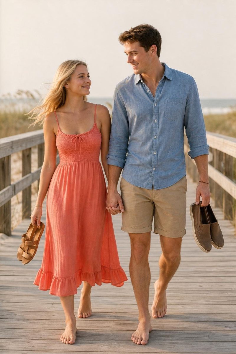
Beach. Sand and water are pale and cool, so pale cool clothes vanish into them. Go with soft warm neutrals that lift off the sand, or blues that stay deeper than the water. Flowing fabric earns its place because wind is guaranteed, and for couples, beach session looks for two should be planned around the tide and the light, not just the color.
Field or park. Green dominates the background nine months of the year, and green fights with green, so olive on a summer lawn disappears. In autumn the background turns warm and busy, which flips the equation: now you want quieter, cooler tones. That is the logic behind autumn family photo palettes leaning on cream, grey blue, and soft camel instead of the orange everyone reaches for first.
Urban. Concrete, brick, and glass are hard, cool, and high contrast, so structured pieces hold up best: a clean coat, tailored trousers, a knit with shape. Watch for red brick, which throws warm color and clashes with pink and orange.
Studio. The background is controlled, so the clothes do almost everything. Deep jewel tones and true black shine here, and texture matters more because there is no scenery adding interest. Ask what backdrop color is being used before you pick anything.
Home. Your walls, sofa, and bedding are the background, and most homes lean warm and light. Soft, tonal clothing works best: knits, simple dresses, layered neutrals. This is the one setting where bare feet look right.
Engagement and couples photos specifically
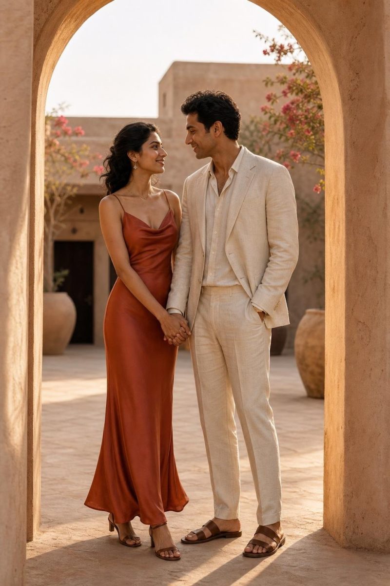
Two people is a different problem than six. With a group, your job is preventing chaos. With a couple, your job is creating enough difference that the frame has depth, because nothing else is carrying it. Two people in the same beige, standing close, photograph as one soft shape.
The method I use is contrast in value, harmony in tone. One of you goes lighter, one goes deeper, and both stay in the same color family. Cream and camel. Dusty blue and navy. Soft grey and charcoal. You read as a pair without reading as a set, and when you stand cheek to cheek there is still a visible edge between you.
Formality has to agree, and this is where couples go wrong most often. A floor length gown next to a casual tee is not a look, it is a mismatch. Decide together whether the session is dressed up, in between, or genuinely casual, then both commit. These engagement session outfit ideas are a good place to start narrowing, and this set of outfit combinations for two people helps you test pairings side by side.
On literal coordination: I am not against a shared element for couples the way I am against it for groups. Two people can share a color and still look right, because there are only two of you and the eye handles it. There is a real case for deliberately paired looks for two when they use different silhouettes and different fabric weights. Same color, different everything else.
Movement matters more with two people, because you will be walking, spinning, and being asked to whisper things, so a skirt or dress that moves gives the photographer something to work with. Check your hands too, since rings get photographed and sleeves decide how the wrist reads. The same thinking carries over to anniversary session outfits, which usually lean a little more polished because couples book them for a milestone, often on a trip, where vacation outfits built for the destination have to carry the photos and the rest of the day.
Family photos with young children
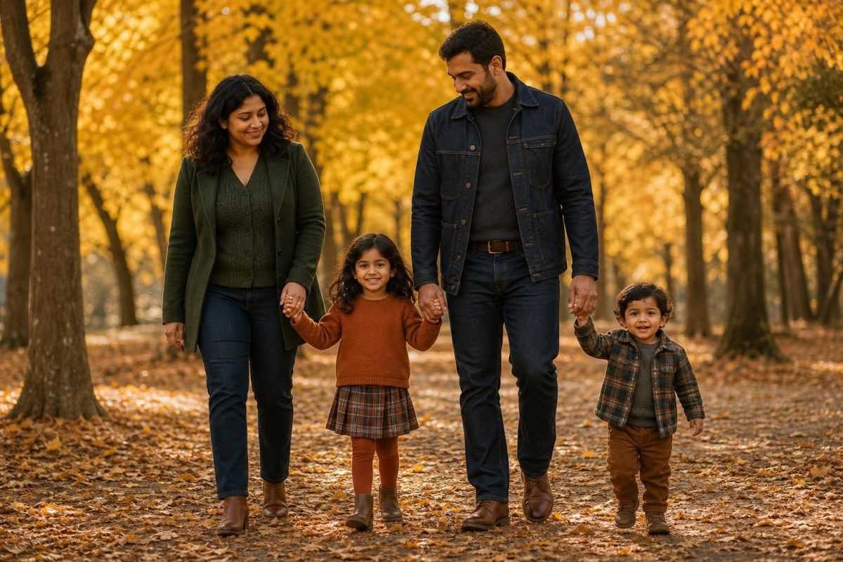
Every rule above is still true, and none of it survives contact with an unhappy three year old. Comfort is the deciding factor, because a child who is itchy or overheated will not look at the camera.
Ban anything that needs constant adjusting: strapless anything, waistbands that slide, bows that untie, headbands that migrate, collars that flip up. If a piece needs an adult to fix it every few minutes, you are buying a session of somebody’s arm reaching into the frame. Let the child play in the outfit at home first and watch what fails.
Bring a spare, not a full backup wardrobe: one clean top per small child, kept in the car. Bring snacks that are not orange and not sticky, and hold them until after the first set of photos. Shoes should be ones they have already worn, because new shoes plus a grassy field equals a child who wants to be carried.
Let the kids be the softest colors in the group. Small people in the deepest color tend to read as a dark spot low in the frame, so put them at the lighter end of your palette and let the adults anchor the darker end. If you are working around a toddler specifically, these toddler friendly family outfit picks account for movement and mess, and this broader set of family session outfit ideas helps once you are assembling the whole group.
What the men in the photo should wear
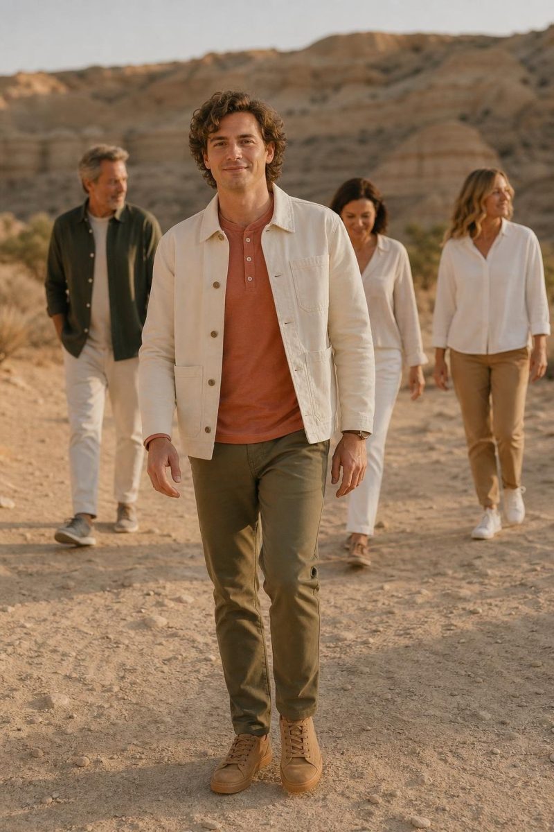
Keep it simple and keep it fitted. A solid shirt in a palette color, trousers or dark denim without distressing, and shoes that are not sneakers unless the session is casual. Fit does more than anything else, because a shirt that pulls at the shoulders or bags at the waist is the first thing you notice in every frame.
Layers help. A sweater over a collared shirt gives the photographer two looks from one person. Skip novelty ties, cargo pockets, and visible branding, and check the undershirt, because a white crew neck peeking out of an open collar undoes a good outfit. Get a haircut a week ahead, not the day before.
FAQ
What colors are best for family photos?
Soft, low saturation colors photograph best: cream, oatmeal, camel, dusty blue, sage, warm grey, and muted rust. Build from two neutrals plus one accent rather than picking five colors you like individually. The answer also depends on your background, so lean warm against green fields and cooler against autumn leaves or brick.
Should everyone wear the same color for family pictures?
No. Identical colors flatten a group into a single shape and make the photo look dated fast. Keep everyone inside one palette but give each person a different shade, texture, or garment type so the camera can separate bodies standing shoulder to shoulder.
What should you not wear for photos?
Skip tiny tight patterns that cause moire, large logos or text, and neon brights that cast color onto skin. Avoid sheer fabric in direct sun and all black against a dark background, and be careful with unlined linen, which creases the moment you sit in a car. Anything that needs constant adjusting belongs here too.
What should I wear for engagement photos?
Pick one color family, then split it so one of you wears a lighter value and the other wears a deeper one, which keeps you visually separate when you stand close. Agree on formality first, because a mismatch in how dressed up you are shows immediately. Choose something with movement, since engagement sessions involve a lot of walking and turning.
One last thing: most of the photos you keep are not from booked sessions, they are from events, so the same rules apply to what you wear as a wedding guest when someone points a camera at your table. Settle the clothes three days out, hang everything together in one place, and look at it as a group before the day arrives. That single habit prevents the parking lot argument. Pick the palette, spread it around, keep the kids comfortable, then forget the outfits once you are there.

About the Author
Rachel Meyers
Contributing Fashion Creator · Amazon Influencer
Rachel Meyers is a contributing fashion creator for The Better Fit, filming try-ons from Orem, Utah. She has spent three years in the Amazon Influencer Program and is an All-Star contributor in the Viral Vue creator community, and her storefront, Rachel's Reviews and Fun Finds, leans into women's fashion and shoes. Rachel is also a certified life and health coach, and that double life shapes how she reviews: she cares less about how a piece photographs and more about how it feels on a school run, at work, or on the third wear. Her latest try-ons land on YouTube at @rachelsfunfinds.