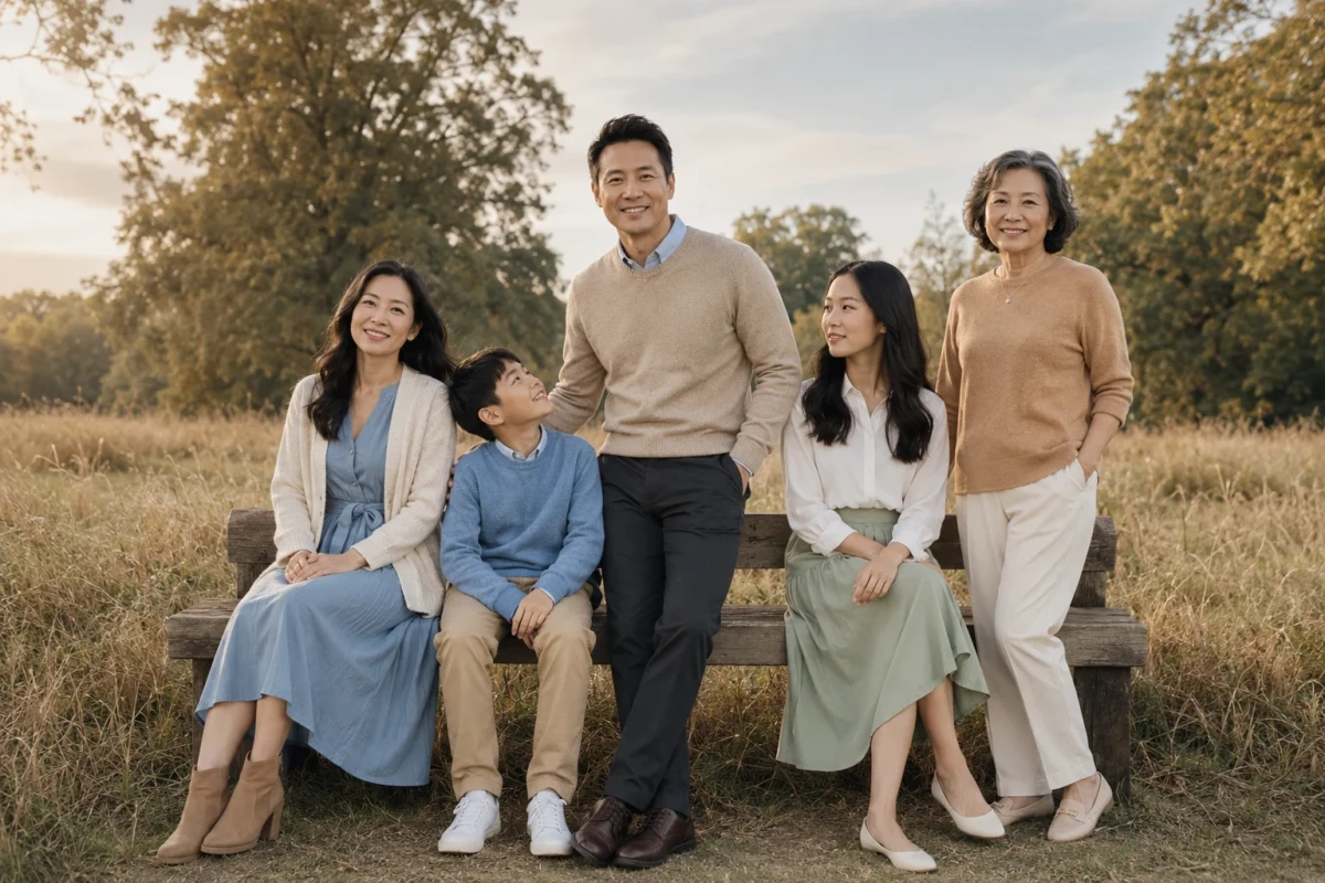
Family picture outfits should be well coordinated while not being too matchy. It should not be exactly a uniform. Everyone should not be wearing the exact same thing unless that is the look that you are going for.
What looks good in group pictures is having everyone follow some sort of color palette or general standard. This should mean that everyone is dressed somewhat to the same formality. There shouldn’t be any big gaps in the dress code.
These are examples of ways to coordinate your family’s outfits in natural-looking, easygoing outfits.

When photographing in the park, we can pull colors from the nature that is surrounding us. Here we have a fall backdrop, so it’s natural to bring in those rich colors that either coordinate well with the leaves or contrast well.
We have navy, which contrasts well with the burnt orange of the leaves. The burnt orange in the little boy’s pants is a reflection of the fall trees. We have the sage green, which is definitely seen all throughout nature. Because of the solid colors, it feels modern and not too printed, because we do have the print and pattern already popping naturally in the park.
2. Turquoise, Sand, and Chocolate for Western-Inspired Photos

This is definitely more of a fun one that might not come to mind for most of us when thinking about how to dress our family for photos, but it’s fun in a not-too-costumey way. Western-inspired outfits can be played up or down. Here it’s definitely played up western. We have the cowboy boots. We have the suede jackets.
The suede jackets are trendy while also being on theme. Her turquoise shirt matching the turquoise jewelry is a fun pop of color that adds a little bit of personality and style to her outfit while still matching the theme.
Overall, I would say if you have a backdrop that lends itself easily to a casual theme like this, absolutely go for it. Here they are definitely on a horse ranch or maybe in the desert, something that lends itself easily to looking western. It would make less sense to dress western with the Manhattan skyline in the background or maybe at the beach, but here it definitely makes sense and it’s trendy. It doesn’t feel like a costume.
3. Plum, Charcoal, and Soft Gray for Urban Photos

This is going the other direction with the theme. The urban photos naturally take on a little bit more of a sleek, modern look. We are feeling chic because of the somewhat limited color palette, especially with the leather details in everyone’s shoes. These outfits are coordinated but not exactly matching.
Again, I like that the mom is having a pop of color. It feels a little bit more trendy than if she were to be wearing all black as well. It’s just enough color to feel like we’ve added a little bit of personality while the color palette still generally remains sleek.

4. Mustard, Denim, and Olive for a Casual Field Shoot

Again, the colors of the backdrop are repeated in the colors of the outfits. The focus should be on the family and their faces, so the outfits should look good and fashionable without pulling attention away from the photo as a whole. That means the colors and overall style of the outfits should match the landscape and background in some way.
Here we have denim, we have corduroy. It’s natural, hardworking, durable fibers that make sense for a day walking through a field. Their shoes are all matching brown leather accents overall. I like that they have denim throughout each of their outfits while adding soft fibers for the girls and then corduroy, a little bit more of a durable, sturdy fiber, for the boys.
5. Cranberry, Camel, and Dark Wash Denim for Holiday Cards

Here’s a little bit of a brighter option, which lends itself easily to holiday cards. With holiday cards, we naturally think of holiday colors like a bright cranberry or a sage green. It’s nice to lean into the holiday theme while again not going too costumey.
A cute little dress like this, a knit dress that is forgiving, is a good length. They look warm even if they may not be taking this photo in December. It’s a fairly neutral color palette because of his camel jacket, but he’s still on theme with his plaid scarf.
6. Sage, Cream, and Deep Brown for Soft Outdoor Photos

What’s really standing out in these photos is the natural fibers that match well with the environment that they are in. It feels like the girls are wearing linen. Linen is a great breathable fiber. It feels high quality and it also is pretty noticeable even in photos. It feels relaxed. It still feels structured while reading somewhat easygoing.
The cut of her dress is definitely not super fitted. It is flattering, while all of them are wearing pretty loose clothing. I like that they’re all wearing leather sandals.
Again, we see that the footwear is more matching than just coordinated. I think that when the colors are slightly different and the garments are slightly different, it’s nice to add a matching shoe to really pull things together rather than a matching shirt or matching pant.
7. Mauve, Chocolate, and Soft Blue for Newborn Family Photos

Mauve is a lovely color that deserves more use, and here it makes the blue stand out. Chocolate brown, especially in a full outfit like this, flatters a wide range of skin tones.
A dark chocolate brown is very unexpected. I also think we get a similar effect with a deep navy. In a full outfit, deep navy feels very rich and intentional while you’re not doing too much.
Overall, the fabrics that everyone is wearing are soft knits. It feels like you are at home. It feels upscale casual.
8. Garnet, Olive, and Black for Christmas Tree Farm Photos

This dress is definitely a statement and very flattering. It feels very Christmasy while she’s playing it down with the winter boots and the plain-colored scarf.
I love the way that this statement dress is complemented by what her family is wearing. They have the workwear jackets on and then everyone is wearing the matching winter boots. It feels like it makes sense. He is warm. She is warm. The baby is warm. It doesn’t feel like they threw on an outfit that is not fit for the environment that they are in.

Here is a more indoor version of the family portrait. Indoor family photos can be pulled off very well. I think our first inclination is to take the family photos outside, but with the right lighting and the right outfits to make you pop and the environment pop, they can be done very well.
Here we have burgundy, navy, and oatmeal. Those are coordinating colors. They are definitely classic capsule wardrobe colors. They feel like old money colors.
I love burgundy in a full outfit. You can also do burgundy with a top and a skirt. You could do burgundy with pants and a shirt. Burgundy looks great, especially on women, in a full outfit like this. I think navy lends itself more easily to men.
Cream and navy are very nice colors together, as are brown and navy. I like the charcoal pant lightening up his outfit a little bit. Again, we have the coordinating footwear. Both of them are brown leather.

Here the kids are matching colors, or coordinating colors. That is a fun take. I think often we see the mom standing out individually with what she is wearing. I really like the kids matching here and then the parents having the blue as kind of a contradiction.
Especially because there are a few kids here, not just one or two, it’s fun to have them pointed out more with their colors, and then the parents can have a little bit more individuality with their outfits.
11. Mint, Charcoal, and Denim for Early Spring

Here is a more casual option for realistic family photos. These could be outfits that are easier to convince your family to wear, or your husband to wear. It feels very natural but still flattering.
He is wearing a denim shirt, black pants, and a charcoal blazer. Everyone’s wearing white tennis shoes. Those colors go great together.
Where the personality and the pop of color is coming in here is in her outfit. It’s in the mint. Mint does go very well with charcoal. I could also see her wearing maybe a light pink, a light purple, something pastel. Especially when we’re thinking of early spring, pastel is a natural color to choose.
12. Lavender, Slate, and White for Spring Blossoms

Here again is an early or mid spring photo shoot. That is a great time of the year to take photos with your family. It’s one of the most beautiful times of the year with the flowers. They are definitely leaning into that floral color palette here without adding any actual pattern.
Her outfit is doing all of the color work, or almost all of it, with brightness, while his fades a little bit but does still have a tinge of blue. It’s kind of like a feminine and masculine side there.
I like that the child is the neutral in the middle with the white. I could also see this going the other way. The parents could wear white, or white and charcoal, more neutral colors, and then the child could have a pop of color themselves.
13. Emerald, Tan, and Black for Dressy Indoor Photos

This is like a richer version of the indoor photos that we saw earlier. I like that the lighting is a little bit moodier and then the outfits are a little bit more sophisticated and moodier themselves.
Velvet adds a really interesting texture that your eye catches right away in photos. The light almost sits on the velvet and pulls us to it right away.
The boys are wearing chic outfits that still feel comfortable and not at all impractical. It’s a little bit of a mission to get a toddler to wear something that looks sophisticated and chic while not looking like they’re wearing a costume.
14. Blush, Wine, and Espresso for Romantic Family Photos

Here we have a little bit of pattern. This is a more coordinated way to have your outfits while being less matchy. I like that we have a little bit of pattern in the dress. The floral has some burgundy, which is reflected in the man’s top. The brown in her jacket is kind of grounding everything, while everyone’s brown footwear is definitely coordinating.
I also like that they are adding layers of warmth in different ways. The mom has a jacket on, while the daughter has tights and no jacket. The little boy is wearing a sweater, the dad is wearing a sweater. It feels more interesting because they aren’t layering in exactly the same way, but everything is still coordinated.
15. Marigold, Forest, and Dark Brown for Fall Leaves

This is definitely a reflection of the environment around them. We have again the dark brown base. This is a great option if you would like to keep things simple.
We often see a color-washed base as black, like a full black base in our outfits individually. However, if you’re going to do that in group photos, it tends to read a little bit too dark. So going with a full brown base, even a full navy base, even a full charcoal base, is a good alternative to the full black base that we often use in outfits.
16. Aubergine, Moss, and Taupe for Moody Fall Photos

With two people, there is less to coordinate. These outfits still match the setting. His outfit blends in with the nature around him, but he doesn’t get lost in the photo because of the contrast between the colors he is wearing and the colors of the background.
I do like that the aubergine is somewhat unexpected with the green. It feels like we’re adding just the right amount of color here, while they’re both deep, rich colors that go well together.

Sometimes you can pick a couple colors for your base and throw in one little accent of a brighter pop of color. The way that they did that here is navy bases. The dad is wearing completely navy. That is always flattering. Navy is a great color to just color wash an outfit with.
Then we have gray here. It’s a lighter gray, which is nice to add with navy. It doesn’t get lost as much. Black also matches well with navy. We don’t have a medium gray, which might not stand out as well, but with that simple color palette they chose one little accent, which is the raspberry. It’s unexpected against the navy, but it’s not so much color that it feels like noise.
18. Cobalt, Camel, and White for a Polished Brunch Portrait

When you think about colors that go well together in your own outfit, like blue and gray or blue and brown, these are complementary pairs that we know go well together. I like that she is wearing blue and gray together, which looks good, but then also he is matching her while not wearing any of the same colors.
Blue and brown look so good together, and we can see that they’re complementing each other while not wearing exactly the same thing. Even their shoes are coordinating without being the same color.
19. Peach, Teal, and Warm Brown for Sunset Photos

The time of day definitely impacts how your clothing is going to look. I think that they’re getting away with this bright teal here, which is definitely a bold choice, because the sunset is so bright itself. It feels like you almost need something to be the same weight as the heavy sunset.
We have the brown accents. She has a bright shirt on. I think that in the daytime, this bright coral with the bright teal might not make sense, but for sunset it definitely does. Also, with their khaki brown pants, it feels more casual than if he were to wear a black pant.

Again, the velvet feels very moody. We have the old money colors, burgundy and navy. I love a navy color wash. This feels very expensive, very romantic, and warm and cozy.
I like her silk shirt popping out underneath the velvet. That contrasting fabric also draws our eye, as does his collar and shirt. They’re not the same colors, but we’re definitely getting the same feeling from both of their outfits because of the construction and the expensive, high-quality fabrics.
What to Shop for These Outfits
Neutral pieces that work under any of these color palettes.
- Levi’s Ribcage Straight Jeans. Dark denim works as the base for palettes like #4 and #5 and leaves the coordinating to the colors on top.
- Genuine Leather Belt with Pin Buckle. A brown belt picks up the chocolate and deep brown in #2, #6 and #7.
- PRETTYGARDEN Open Front Oversized Cardigan. A soft layer in cream or camel for the sage palette in #6 or the cobalt and camel look in #18.

About the Author
Rachel Meyers
Contributing Fashion Creator · Amazon Influencer
Rachel Meyers is a contributing fashion creator for The Better Fit, filming try-ons from Orem, Utah. She has spent three years in the Amazon Influencer Program and is an All-Star contributor in the Viral Vue creator community, and her storefront, Rachel's Reviews and Fun Finds, leans into women's fashion and shoes. Rachel is also a certified life and health coach, and that double life shapes how she reviews: she cares less about how a piece photographs and more about how it feels on a school run, at work, or on the third wear. Her latest try-ons land on YouTube at @rachelsfunfinds.